
Image Backdrop
Layered image with drop shadows, blur effects, and inner shadows. Pure CSS, no JavaScript.
3
Shadow Types
5
Variations
CSS
Powered By
01
Variation 01
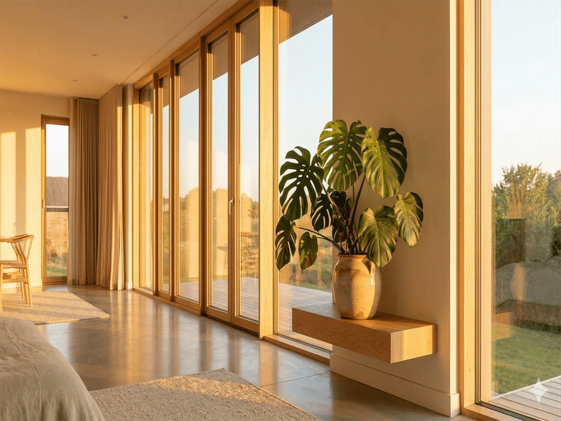
Drop Shadow
Single drop shadow with 12px border radius. A clean, elevated card look.
drop_shadows=1
border_radius=12
background_blur=0
02
Variation 02
Layered Shadows
Two shadow layers for realistic depth. Close shadow for definition, far shadow for elevation.
drop_shadows=2
border_radius=12
background_blur=0
03
Variation 03
Background Blur
Subtle frosted-glass effect at 4px intensity with a light tint overlay.
background_blur=4
border_radius=12
drop_shadows=1
04
Variation 04
Inner Shadow + Radius
Inner shadow with 20px border radius. Adds a subtle inset depth effect to the image.
inner_shadow=yes
border_radius=20
background_blur=0
05
Variation 05
No Shadow, Pill
Heavy 50px border radius with no shadows at all. A clean pill-shaped image frame.
border_radius=50
drop_shadows=0
background_blur=0
All Variations
All Available Options
Image Size
ThumbnailMediumLargeFull
Other Controls
Blur Radius (px)Shadow Offset X (px)Shadow Offset Y (px)Shadow Blur (px)Shadow Spread (px)Shadow ColorBackdrop ColorBackdrop Opacity